Maybe I'm just being hopeful but this could signal that the powers that be are ready to embrace our original and more powerful team branding:
The University of California
California
Cal
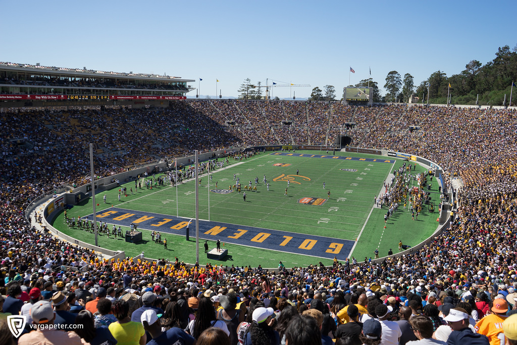
At the very least it means there's no current plan to re-brand athletics under the weaker Berkeley/Cal-Berkeley/UC Berkeley umbrella. Or I'm just reading too deeply into this and all it means is a new end zone and sideline design since the end zones already said "California" it was just previously in the block lettering. Regardless I'm a big fan of the gold end zones with the script California and the home sideline with "The University of California" stencil. As always the script Cal at centerfield is great, I wouldn't mind seeing the block 'C' there for the Joe Roth game and maybe the triple stripe in the end zones for that game at least but that might just be me
The University of California
California
Cal
At the very least it means there's no current plan to re-brand athletics under the weaker Berkeley/Cal-Berkeley/UC Berkeley umbrella. Or I'm just reading too deeply into this and all it means is a new end zone and sideline design since the end zones already said "California" it was just previously in the block lettering. Regardless I'm a big fan of the gold end zones with the script California and the home sideline with "The University of California" stencil. As always the script Cal at centerfield is great, I wouldn't mind seeing the block 'C' there for the Joe Roth game and maybe the triple stripe in the end zones for that game at least but that might just be me
New Cal football field in development at Memorial Stadium!
— Avinash Kunnath (@avinashkunnath) February 11, 2023
Gold end zones.
California script.
The University of (pregnant pause) California. pic.twitter.com/9Kb8VAjh6H