New Field Design & Possible Branding Implications

6,717 Views | 53 Replies | Last: 1 yr ago by LunchTime
GivemTheAxe
How long do you want to ignore this user?
Cal_79 said:

LunchTime said:

Cal_79 said:

ColoradoBear said:

Script full 'California' is kinda hideous and on top of that out of proportion to the size of the endzone.

But good bye to UA and the Sather Stripe. Did we get a nice multi million dollar parting gift?

What makes script 'California' hideous and how is it out of proportion to the size of the end zone?


Endzone large. Letters little.

The graphic looks balanced to fit the dimensions of the endzone. What's your point?


The more I look at the design the more I like it.
Particularly I like the script California a lot.

I certainly hope the university has copyrighted this as another logo meaning Cal.

The word California cannot be copyrighted but the script California can be. It is Ours. I believe that the Cal Band has been using the script California for years whenever there is a conjunction of the Cal Band with the Alumni Band.

Too bad that the use of a script "Cali" is already on the market. Otherwise maybe we might have copyrighted that
TheFiatLux
How long do you want to ignore this user?
Cal_79 said:

LunchTime said:

Cal_79 said:

ColoradoBear said:

Script full 'California' is kinda hideous and on top of that out of proportion to the size of the endzone.

But good bye to UA and the Sather Stripe. Did we get a nice multi million dollar parting gift?

What makes script 'California' hideous and how is it out of proportion to the size of the end zone?


Endzone large. Letters little.

The graphic looks balanced to fit the dimensions of the endzone. What's your point?
I think he made it. I agree with him. I think it looks odd. Same way Ucla's and USC's endzone look odd to me.

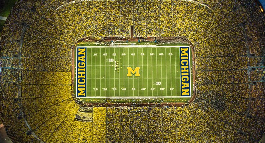
To me, this is how you use the endzone

southseasbear
How long do you want to ignore this user?
TheFiatLux said:

Cal_79 said:

LunchTime said:

Cal_79 said:

ColoradoBear said:

Script full 'California' is kinda hideous and on top of that out of proportion to the size of the endzone.

But good bye to UA and the Sather Stripe. Did we get a nice multi million dollar parting gift?

What makes script 'California' hideous and how is it out of proportion to the size of the end zone?


Endzone large. Letters little.

The graphic looks balanced to fit the dimensions of the endzone. What's your point?
I think he made it. I agree with him. I think it looks odd. Same way Ucla's and USC's endzone look odd to me.

To me, this is how you use the endzone


The Michigan field design is impressive! On the other hand, that is their design and I'd rather we do something original. i love the California script. Yes, it leaves the East and West edges of the endzones look bare but perhaps they will add a design element such as a Big "C," walking bear, or the interlocking UC.
Fire Knowlton!
Fire Fox!
Put Wilcox in a hot seat!
CJ Loves Cal
How long do you want to ignore this user?
southseasbear said:


The Michigan field design is impressive! On the other hand, that is their design and I'd rather we do something original. i love the California script. Yes, it leaves the East and West edges of the endzones look bare but perhaps they will add a design element such as a Big "C," walking bear, or the interlocking UC.


That's my thought too, especially given the similar gap on the east sideline.

What would you say to the walking bear . . . walking over the word "Berkeley?"
Go!Bears
How long do you want to ignore this user?
Cal_79 said:

OneTopOneChickenApple said:

Strykur said:

Bobodeluxe said:

The size is proportional to our scoring.


It looks good but why the inverted colors dammit.
Agree. I would like the endzones blue with gold script. The gold endzones look a bit jarring and pop out a bit much.

Perhaps being distinctive and "popping out" is by design. I like the look.
Maybe it will be easier to find them?
TheFiatLux
How long do you want to ignore this user?
Go!Bears said:

Cal_79 said:

OneTopOneChickenApple said:

Strykur said:

Bobodeluxe said:

The size is proportional to our scoring.


It looks good but why the inverted colors dammit.
Agree. I would like the endzones blue with gold script. The gold endzones look a bit jarring and pop out a bit much.

Perhaps being distinctive and "popping out" is by design. I like the look.
Maybe it will be easier to find them?
ZING!!!!
WalterSobchak
How long do you want to ignore this user?
TheFiatLux said:

To me, this is how you use the endzone
I'm sure if we could do this we would've seen it already. We can't, for reasons that should be obvious. Same with USC and Ucla, for even more obvious reasons.
Please give to Cal Legends at https://calegends.com/calegendsdonate/donate-football/ and encourage everyone you know who loves Cal sports to do it too.

To be in the Top 1% of all NIL collectives we only need around 10% of alumni to give $300 per year. Please help spread the word. "If we don't broaden this base we're dead." - Sebastabear

Thanks for reading my sig! Please consider copying or adapting it and using it on all of your posts too. Go Bears!
WalterSobchak
How long do you want to ignore this user?
CJ Loves Cal said:

southseasbear said:


The Michigan field design is impressive! On the other hand, that is their design and I'd rather we do something original. i love the California script. Yes, it leaves the East and West edges of the endzones look bare but perhaps they will add a design element such as a Big "C," walking bear, or the interlocking UC.


That's my thought too, especially given the similar gap on the east sideline.

What would you say to the walking bear . . . walking over the word "Berkeley?"
What would yo say to the bear walking over the words "California Republic"?
Please give to Cal Legends at https://calegends.com/calegendsdonate/donate-football/ and encourage everyone you know who loves Cal sports to do it too.

To be in the Top 1% of all NIL collectives we only need around 10% of alumni to give $300 per year. Please help spread the word. "If we don't broaden this base we're dead." - Sebastabear

Thanks for reading my sig! Please consider copying or adapting it and using it on all of your posts too. Go Bears!
CJ Loves Cal
How long do you want to ignore this user?
I'm all for use of the state flag!!
But I'm trying to think along the lines of what they're actually likely to do - per the stated goals.

And within that, incorporating "Berkeley" into the Bear logo does have some upside:
- it avoids the obvious abominations of Cal Berkeley, or California Berkeley
- graphically, it shows "Cal" (the Bear) on top of (maybe even dominating??) "Berkeley."

Instead of Berkeley modifying Cal or California, Cal proclaims it's place as creator, progenitor, and true representative of "Berkeley" (both the town and the gown.)

If using Berkeley *somewhere* in our athletic marketing and logos is the price we have to pay to give those on the academic side who want to the right to wave a script Cal flag in celebration of their many triumphs (a right they don't have now) I think, that would be a decent way to go for it.
WalterSobchak
How long do you want to ignore this user?
This assumes an incorporation. I don't agree with that as a base premise. All we ever see is Berkeley encroaching into other areas. No other state flagship diminishes that status by incorporating the situs into sports branding. There's no compelling reason for Cal to do it either.
Please give to Cal Legends at https://calegends.com/calegendsdonate/donate-football/ and encourage everyone you know who loves Cal sports to do it too.

To be in the Top 1% of all NIL collectives we only need around 10% of alumni to give $300 per year. Please help spread the word. "If we don't broaden this base we're dead." - Sebastabear

Thanks for reading my sig! Please consider copying or adapting it and using it on all of your posts too. Go Bears!
southseasbear
How long do you want to ignore this user?
WalterSobchak said:

This assumes an incorporation. I don't agree with that as a base premise. All we ever see is Berkeley encroaching into other areas. No other state flagship diminishes that status by incorporating the situs into sports branding. There's no compelling reason for Cal to do it either.

The law school at Cal becomes "Berkeley Law." Will the California Law Review be renamed "Berkeley Law Review?"

Hastings College of the Law becomes UC College of the Law. Will the Hastings Law Journal be renamed the UC Law Journal?

Seems as if we are losing ground.

I'm ok with incorporating the name "Berkeley" as long as we keep it subordinate to California.
Fire Knowlton!
Fire Fox!
Put Wilcox in a hot seat!
HearstMining
How long do you want to ignore this user?
I agree that the script California looks small, but I don't see a good way to scale it up without looking squeezed between the goal line and the back of the end-zone. So, what if you kept text the same size, shifted it to the left and then had a single blue walking bear in the resulting space to the right? This would be balanced but more interesting than having smaller bears on either side of centered text.
Cal_79
How long do you want to ignore this user?
HearstMining said:

I agree that the script California looks small, but I don't see a good way to scale it up without looking squeezed between the goal line and the back of the end-zone. So, what if you kept text the same size, shifted it to the left and then had a single blue walking bear in the resulting space to the right? This would be balanced but more interesting than having smaller bears on either side of centered text.

Why does the space need to be filled with something other than gold?
HearstMining
How long do you want to ignore this user?
Cal_79 said:

HearstMining said:

I agree that the script California looks small, but I don't see a good way to scale it up without looking squeezed between the goal line and the back of the end-zone. So, what if you kept text the same size, shifted it to the left and then had a single blue walking bear in the resulting space to the right? This would be balanced but more interesting than having smaller bears on either side of centered text.

Why does the space need to be filled with something other than gold?
Doing what you suggest is an option. I thought that adding a simple graphic like the walking bear was an interesting contrast to the ornate script California - almost acting like an exclamation point after the word.
I claim no expertise in this area, other than once scoring well on a spatial perception test at the Cal counseling center.
GivemTheAxe
How long do you want to ignore this user?
southseasbear said:

WalterSobchak said:

This assumes an incorporation. I don't agree with that as a base premise. All we ever see is Berkeley encroaching into other areas. No other state flagship diminishes that status by incorporating the situs into sports branding. There's no compelling reason for Cal to do it either.

The law school at Cal becomes "Berkeley Law." Will the California Law Review be renamed "Berkeley Law Review?"

Hastings College of the Law becomes UC College of the Law. Will the Hastings Law Journal be renamed the UC Law Journal?

Seems as if we are losing ground.

I'm ok with incorporating the name "Berkeley" as long as we keep it subordinate to California.


No! NO! NO!!!!!
Keep the word Berkeley far far away from Memorial Stadium. I can see any use of that word in connection with Cal Athletics being the beginning of the end of Cal and California.

There are plenty of administrators on the Cal Campus and at the level of the Entire University eager to make Cal just one of the "UC's". Don't let the camel slip its nose under the tent. (No ethnic pejorative intended).

Next thing we know we will be branded as Cal Berkeley or UC Berkeley
Bobodeluxe
How long do you want to ignore this user?
I went to UC Berkeley.
BearsWiin
How long do you want to ignore this user?
bluehenbear said:

ODE BESAR!

(Anyone remember that?)
I still have the Ode Besar shirt that I wore to the Insight Bowl
dimitrig
How long do you want to ignore this user?
Bobodeluxe said:

I went to UC Berkeley.


What do you see?

LunchTime
How long do you want to ignore this user?
Cal_79 said:

LunchTime said:

Cal_79 said:

ColoradoBear said:

Script full 'California' is kinda hideous and on top of that out of proportion to the size of the endzone.

But good bye to UA and the Sather Stripe. Did we get a nice multi million dollar parting gift?

What makes script 'California' hideous and how is it out of proportion to the size of the end zone?


Endzone large. Letters little.

The graphic looks balanced to fit the dimensions of the endzone. What's your point?


You asked the question, goofy.

>how is it out of proportion to the size of the end zone?

I didn't say it's out of proportion, but the proportions are endzone big, letters little. That's how someone would say it is out of proportion.

Why are you asking questions if you say "what's your point" when you get the answer.
Refresh
Page 2 of 2
 
×
subscribe Verify your student status
See Subscription Benefits
Trial only available to users who have never subscribed or participated in a previous trial.