Back by popular demand 😮💨#GoBears | #ALLIN pic.twitter.com/s7SzxHcb7o
— Cal Football (@CalFootball) September 30, 2024
New Helmets
3,756 Views |
36 Replies |
Last: 1 mo ago by calumnus
OK, which of you were demanding this?
Eastern Oregon Bear said:
OK, which of you were demanding this?
I *love* the mid-80s helmet and really hope they release some new merch because my crewneck with that logo is on death's door but the paw looks 20% too small?
The paw is too small, and I hate the matte finish. Why change the helmet now? I think the two we've been using are great.
I am assuming the helmet will correspond to the rumored "new" throwbacks to be used for this game - the 100 year anniversary jersey from 1982 could be in play.
~Spectemur agendo~
You're correct the paw is too small...but I like the attempt. I loved the paw....honors joe japp too.
That paw too smaw.
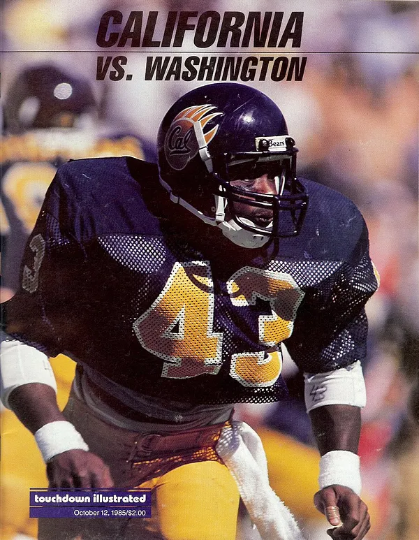
That is the original design, larger paws, stylized/longer fangs, glossy dark navy finish, best Cal football helmet ever.


that design is garbage. way too cartoonish.
looks like something a 5 year old would draw.
we should use the Bear claw marks instead.
looks like something a 5 year old would draw.
we should use the Bear claw marks instead.
BarcaBear said:
that design is garbage. way too cartoonish.
looks like something a 5 year old would draw.
we should use the Bear claw marks instead.
ABSOLTELY agree. Hated these ever since they came out. Amateurish.
Now, the new claw, alone? That makes this Old Blue's spine tingle
How do you know it's not gigantic helmets and a normal size logo?
Yeah. Gotta be big enough like this, so you can see a little of it from the front and from the back.Cal88 said:
That is the original design, larger paws, stylized/longer fangs, glossy navy finish, best Cal football helmet ever.
fillmorecalfan said:Back by popular demand 😮💨#GoBears | #ALLIN pic.twitter.com/s7SzxHcb7o
— Cal Football (@CalFootball) September 30, 2024
Who demanded this? Not a big fan. Do something more Berkeley - like having the Berkelium periodic table symbol? This is a 5th graders drawing.
Could have gone with our Auburn uniforms or Roth uniforms for this one
Give to Cal Legends!
https://calegends.com/donation/ Do it now. Text every Cal fan you know, give them the link, tell them how much you gave, and ask them to text every Cal fan they know and do the same.
https://calegends.com/donation/ Do it now. Text every Cal fan you know, give them the link, tell them how much you gave, and ask them to text every Cal fan they know and do the same.
The bear claw with the script Cal is actually quite "Cal"...it's our old logo.Econ141 said:fillmorecalfan said:Back by popular demand 😮💨#GoBears | #ALLIN pic.twitter.com/s7SzxHcb7o
— Cal Football (@CalFootball) September 30, 2024
Who demanded this? Not a big fan. Do something more Berkeley - like having the Berkelium periodic table symbol? This is a 5th graders drawing.
Could have gone with our Auburn uniforms or Roth uniforms for this one
unless you're talkin about the claw marks? because i don't think those will be on our uniforms...
Claw marks have a passing resemblance to LSUs tiger eye mark at the 50.
~Spectemur agendo~
it's just a decal on our regular navy helmets lolFred Bear said:
Curious to know how much money gets spent on having a helmet we might use once or twice at most during a season vs spending it on stuff that actually matters.
why are people thinking we are getting new helmets? are people thinking that we literally buy a new helmet with each new design? all they're doing is getting new stickers and putting them on either our gold or navy helmets (like the script Cal on the gold helmets)
Agree. Just the claw marks (without the claw) might look pretty cool. Maybe script Cal on one side and claw marks on the other?
F for imagination.
D for execution.

D for execution.

I actually like these helmets.
the helmet in the video is also a CGI version it looks like.Fred Bear said:The helmet in the video looks more like that matte finish that I thought we'd ditched than the helmets we wore vs. Florida State which look fairly shiny to me, but perhaps I'm wrong.CalBearinLA said:it's just a decal on our regular navy helmets lolFred Bear said:
Curious to know how much money gets spent on having a helmet we might use once or twice at most during a season vs spending it on stuff that actually matters.
why are people thinking we are getting new helmets? are people thinking that we literally buy a new helmet with each new design? all they're doing is getting new stickers and putting them on either our gold or navy helmets (like the script Cal on the gold helmets)
just re-upping this to show we didn't spend $$ on new helmets, but on decals. They do look nice!Fred Bear said:The helmet in the video looks more like that matte finish that I thought we'd ditched than the helmets we wore vs. Florida State which look fairly shiny to me, but perhaps I'm wrong.CalBearinLA said:it's just a decal on our regular navy helmets lolFred Bear said:
Curious to know how much money gets spent on having a helmet we might use once or twice at most during a season vs spending it on stuff that actually matters.
why are people thinking we are getting new helmets? are people thinking that we literally buy a new helmet with each new design? all they're doing is getting new stickers and putting them on either our gold or navy helmets (like the script Cal on the gold helmets)
https://instagr.am/p/DAtenZ7yKmv

The Cal script is too small, we should have stuck with our classic design.
CalBearinLA said:just re-upping this to show we didn't spend $$ on new helmets, but on decals. They do look nice!Fred Bear said:The helmet in the video looks more like that matte finish that I thought we'd ditched than the helmets we wore vs. Florida State which look fairly shiny to me, but perhaps I'm wrong.CalBearinLA said:it's just a decal on our regular navy helmets lolFred Bear said:
Curious to know how much money gets spent on having a helmet we might use once or twice at most during a season vs spending it on stuff that actually matters.
why are people thinking we are getting new helmets? are people thinking that we literally buy a new helmet with each new design? all they're doing is getting new stickers and putting them on either our gold or navy helmets (like the script Cal on the gold helmets)
https://instagr.am/p/DAtenZ7yKmv
And we're making UCLA pay for 'em!
I might be in the minority here, but when comparing these bear paw's to the old ones, I like the current/new/small version better.bear2034 said:
The Cal script is too small, we should have stuck with our classic design.
I really REALLY liked the yellow lids that we wore on the road, but I assume that wouldn't have looked right on the all blues. I was wrong on the throwback uni btw; oh well.
I will say this - I kind of wish they had the standard Cal script helmet on the set instead of the alternate version we are playing with.
~Spectemur agendo~
Agree, but love the background to the set!! What a bonanza!bear2034 said:
The Cal script is too small, we should have stuck with our classic design.
how about the Claw marks with Cal script underneath?BearForceOne said:
Agree. Just the claw marks (without the claw) might look pretty cool. Maybe script Cal on one side and claw marks on the other?
Cal88 said:
That is the original design, larger paws, stylized/longer fangs, glossy dark navy finish, best Cal football helmet ever.
Amen to that. - best ever Cal helmet
I can live with the new blue helmet. With bear paw.
I have not liked the yellow helmets with stripe. = too generic
Why’s the Bearclaw backwards?
— Troy Auzenne (@Auz52) October 5, 2024
It's small but the color palette is very good, it will pop in HD for surebear2034 said:
The Cal script is too small, we should have stuck with our classic design.
Cal88 said:Why’s the Bearclaw backwards?
— Troy Auzenne (@Auz52) October 5, 2024
I agree with Troy, the bear claw should be bigger and should be facing forward.
calumnus said:Cal88 said:Why’s the Bearclaw backwards?
— Troy Auzenne (@Auz52) October 5, 2024
I agree with Troy, the bear claw should be bigger and should be facing forward.
The new bear claw design falls really short (literally), it was done by someone who either wasn't around in the 80s or is an outsider who is completely unfamiliar with the older design.
The claw turned backwards looks like some animal struck the players on the head. turned forward it looks like the claws are attacking the opponents, especially when lined up before the snap.

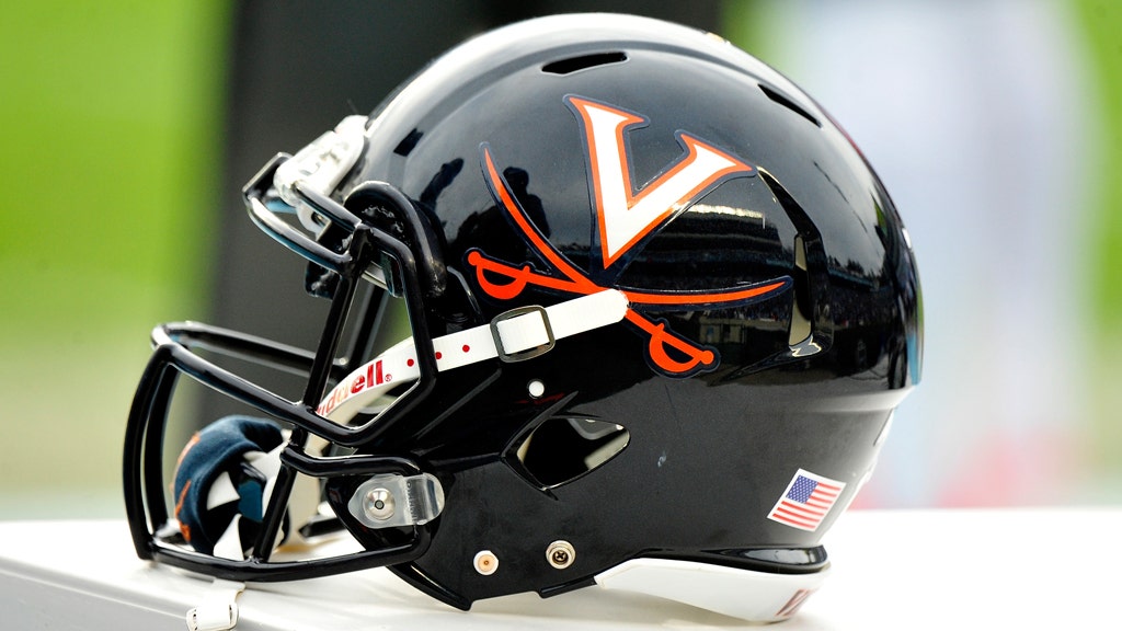
This si the best home uniform in the histoy of the program, classic, classy, minimalist, perfect colors and best helmet design in college football, along with the Virgina solid blue crossing swords.

Whoever was in charge of graphics in 1982 at Cal was really good, I remember these mini-programs, awesome design.
This is also not a new bear claw logo...it's one of our old logos we used to use too. I had a couple shirts back when i was a student with this logoVandalus said:I might be in the minority here, but when comparing these bear paw's to the old ones, I like the current/new/small version better.bear2034 said:
The Cal script is too small, we should have stuck with our classic design.
I really REALLY liked the yellow lids that we wore on the road, but I assume that wouldn't have looked right on the all blues. I was wrong on the throwback uni btw; oh well.
I will say this - I kind of wish they had the standard Cal script helmet on the set instead of the alternate version we are playing with.

calumnus said:Cal88 said:Why’s the Bearclaw backwards?
— Troy Auzenne (@Auz52) October 5, 2024
I agree with Troy, the bear claw should be bigger and should be facing forward.
They went cheap and only made a single decal instead of having mirror images so the claw was forward on both sides. Bush league.
I concur it should be larger like the originals.
I was never a big fan of them, but in honor of Joe Kapp, they are OK.
it's probably for one game...it's fine. lolnwbear84 said:calumnus said:Cal88 said:Why’s the Bearclaw backwards?
— Troy Auzenne (@Auz52) October 5, 2024
I agree with Troy, the bear claw should be bigger and should be facing forward.
They went cheap and only made a single decal instead of having mirror images so the claw was forward on both sides. Bush league.
I concur it should be larger like the originals.
I was never a big fan of them, but in honor of Joe Kapp, they are OK.
Joe Kapp's secretary (and then wife) designed the bear claw helmet and Joe used those when he was at Cal. I think there was some sort of issue with who owned the design, etc which made it a bit of a sticky issue for some time. Anyway, it's back and I love it. The problem is - they only printed the logo one way, and so on one side it is going forward and the other side it is going back. You have to do both sides opposite.Cal88 said:calumnus said:Cal88 said:Why’s the Bearclaw backwards?
— Troy Auzenne (@Auz52) October 5, 2024
I agree with Troy, the bear claw should be bigger and should be facing forward.
The new bear claw design falls really short (literally), it was done by someone who either wasn't around in the 80s or is an outsider who is completely unfamiliar with the older design.
The claw turned backwards looks like some animal struck the players on the head. turned forward it looks like the claws are attacking the opponents, especially when lined up before the snap.
This si the best home uniform in the histoy of the program, classic, classy, minimalist, perfect colors and best helmet design in college football, along with the Virgina solid blue crossing swords.
Whoever was in charge of graphics in 1982 at Cal was really good, I remember these mini-programs, awesome design.
Featured Stories
See All
Bears Dealt First Loss Of Season
by Cal Athletics
Ultimate Insider Podcast E98: Wake Forest Wrap-up, Syracuse Preview
by Mike Pawlawski
Cal Signs Pair Of Prep Standouts
by Cal Athletics
Cal Women's Hoops Signs 4 To 2025 Class
by Cal Athletics
Cal Football Tuesday Weekly Presser
by Jim McGill


