Nike Jersey Discussion Thread

5,408 Views | 37 Replies | Last: 10 mo ago by TBear56
Bearly Clad
How long do you want to ignore this user?
They just released the new sets, what are y'all's thoughts? Personally I love them, I thought they'd be boring or too much like the old Nike gear but they really hit a sweet spot with a classic, clean look.

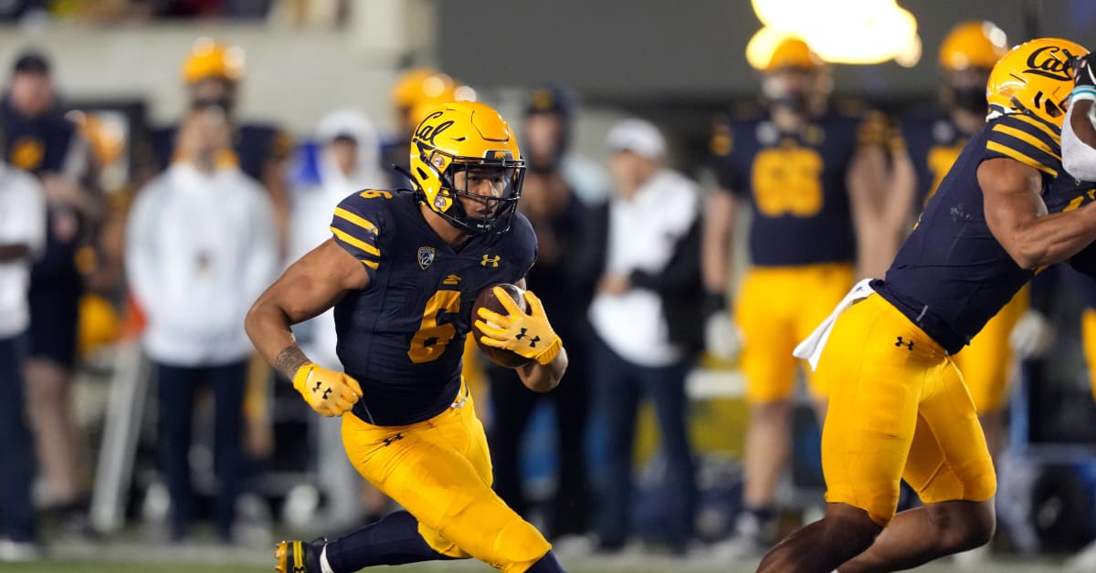
-They got the colors right, I'm a big fan of the triple stripe on the shoulders, gold pants, and gold helmets.

-Actually the block C gold helmets are perfect overall IMO.

-I'm not usually a fan of white jerseys but I think they look great, the gold outline on the numbers is a nice touch.

-Script Cal and no "Berkeley" in sight like some were worried about.

-Now just break out Joe Roth throwbacks and a cool Polynesian alternate for a marquee game to really go viral for recruiting purposes and we're golden (pun intended, sorry)
sosheezy
How long do you want to ignore this user?
The white stripe makes the blue top white pants combo look more natural
alarsuel
How long do you want to ignore this user?
flounder
How long do you want to ignore this user?
beautiful. great job nike!
JSC 76
How long do you want to ignore this user?
Are the Block C helmets going to be in the regular rotation? Or are they just Joe Roth throwbacks? (although since we no longer have a Joe Roth game, the question may be moot.)
bencgilmore
How long do you want to ignore this user?
JSC 76 said:

Are the Block C helmets going to be in the regular rotation? Or are they just Joe Roth throwbacks? (although since we no longer have a Joe Roth game, the question may be moot.)
i would assume they'd use homecoming for the Roth game. Now that we play UCLA for at least 4 years, then UCLA will serve the role as the game going forward when at home. Still leaves the years where we play UCLA on the road (and there's no gaurantee the series goes more than 4 games, though my guess is it will)

conversely, perhaps you could talk UCLA into making the game the Joe Roth game regardless of location? It would become a bigger tradition and something that might get factored in for future realignment. i would assume that's sacrilege to some but it might be easier than "ucla when at home, homecoming otherwise"
Bear_Territory
How long do you want to ignore this user?
Clean and no gimmicks. Looks like a the Packers' uniforms. I'll buy one.
oregoncalbear
How long do you want to ignore this user?
Like the new numbers and white unis. Blues are ok. Glad Berkeley branding is nowhere to be seen.
Big C
How long do you want to ignore this user?
In general, they look good, but I'm not sure why blue-jerseys/white-pants is one of our options. This could be a significant improvement that would be addition by subtraction.

I like the shoulder stripes on the white jerseys better than the ones on the blue jerseys, for some reason.

Bottom line, they seem fine. I can't wait to see how they look in games!
BearoutEast67
How long do you want to ignore this user?
Very nice designs! I saw the Block C on the background but not on the helmets or unis. Cool, memorable old school design.
Donate to Cal's NIL at https://calegends.com/donation/
TummyoftheGB
How long do you want to ignore this user?
Uniforms look good to me. If I were making that reveal video, I would have been tempted to put a beat up laser disk labeled "What do you see? UC Berkeley Ad" in the For the new era box.
Cal88
How long do you want to ignore this user?
I think it's too generic, it's kind of like the standard college football look from 1975-80, it seems more like an ASU or UW look than a Cal look:


Would have preferred solid pants and gold bee stripes over the sleeves for a classic Cal look that's also got lots of retro cachet, similar to the design from recent Big Game special editions:


Craig Morton circa early1960s


These, with a blue helmet, is as good as it gets for a Cal uniform.

This being said, it could have been a lot worse, and it's better than the previous design we had.

01Bear
How long do you want to ignore this user?
JSC 76 said:

Are the Block C helmets going to be in the regular rotation? Or are they just Joe Roth throwbacks? (although since we no longer have a Joe Roth game, the question may be moot.)
I really hope the Joe Roth Game is continued somehow. I didn't know who Joe Roth was when I was a student; I was confused why Cal wore the royal blue uniforms once a year. I only learned about his story from this forum many years after I'd graduated. Afterward, I absolutely became a fan of his story. Even though USC and UCLA are now in a different conference, I still want to see Cal continue the Joe Roth Game tradition.

Also, the Joe Roth uniforms really grew on me. I think i prefer them to the team's regular uniforms.
01Bear
How long do you want to ignore this user?
Cal88 said:

I think it's too generic, it's kind of like the standard college football look from 1975-80, it seems more like an ASU or UW look than a Cal look:


Would have preferred solid pants and gold bee stripes over the sleeves for a classic Cal look that's also got lots of retro cachet, similar to the design from recent Big Game special editions:


Craig Morton circa early1960s


These, with a blue helmet, is as good as it gets for a Cal uniform.

This being said, it could have been a lot worse, and it's better than the previous design we had.


Could it be argued that in Cal's case, it's an homage to the Cal rugby shirts?
alarsuel
How long do you want to ignore this user?
BASURA
Cal88
How long do you want to ignore this user?
01Bear said:

Cal88 said:

I think it's too generic, it's kind of like the standard college football look from 1975-80, it seems more like an ASU or UW look than a Cal look:


Would have preferred solid pants and gold bee stripes over the sleeves for a classic Cal look that's also got lots of retro cachet, similar to the design from recent Big Game special editions:


Craig Morton circa early1960s


These, with a blue helmet, is as good as it gets for a Cal uniform.

This being said, it could have been a lot worse, and it's better than the previous design we had.


Could it be argued that in Cal's case, it's an homage to the Cal rugby shirts?


I'm not sure if the beestripes in the old football jerseys of the 1960s and possibly earlier eras were a homage to Cal rugby, or whether both sports had the beestripes as a standard Cal look.

In any case, they are very unique in college football and look great in gold over dark navy blue.
going4roses
How long do you want to ignore this user?
Just win
How (are) you gonna win when you ain’t right within…
Golden One
How long do you want to ignore this user?
I like them; they are very traditional and classy.
philly1121
How long do you want to ignore this user?
No Sather Stripe? Or did that end with UnderArmour?
TomBear
How long do you want to ignore this user?

Cal 88, I LOVE the striped jerseys you referred to. The year those came out (Morton only wore them for one year, as Randy Gold was the QB prior to his ascension to Varsity), they were supposed to be homage to Cal's teams of the '30s (one of which went to the Rose Bowl and defeated Alabama in 1939). And while I love the look, the team performed miserably while wearing them. Ironically, Marc Levy was the head coach at that time. He was replaced with Ray Willsey, and the tradition at Cal (at that time) was when a new staff came in, the jerseys were changed, and that's when the classic "Willsey jersey" with the Gold "C" on the helmet became the uniform.

Nonetheless, I love those "zebra strip3" jerseys and have a throwback sweater I sometimes wear in cold weather games to pay homage to that uniform.

Because the sleeves of jerseys are now all short, that look will probably never come back again although the uniform worn at last year's Big Game did come close. However, in actuality, that jersey with the 3 stripes is the jersey Cal wore in the last year of Pappy Waldorf's time as coach.

As for the new unis, overall I think they're OK. At least we didn't get "yellow" instead of gold, and (thankfully) there is no white trim around the numerals, which makes the numerals look yellow from a distance.

This look is clean, looks traditional, and I think will represent the Bears well......with the exception of I never ever want to see white pants with blue jerseys at home again. Gold or even blue pants at home....but never white!
Larno
How long do you want to ignore this user?
I go back to the 60's, although I missed the striped sleeves. Anyway, my take, for what it's worth:

1. No all gold uniforms. Ugly. Gives bananas a bad name.

2. Have never liked blue pants and gold tops, although better than all gold. Don't know if that's a
consideration.

3. No white pants for home games. I don't even like them for away games. All white does nothing for me.

4. NO BLACK EVER! It's never happened and it better not. I don't know why teams that do not have
black in their colors (that's you, Stanford) do it. Well, I guess the young kids like it. I say, get off my
lawn!

Having said all that, I like the new uniforms.
Cal88
How long do you want to ignore this user?
TomBear said:


Cal 88, I LOVE the striped jerseys you referred to. The year those came out (Morton only wore them for one year, as Randy Gold was the QB prior to his ascension to Varsity), they were supposed to be homage to Cal's teams of the '30s (one of which went to the Rose Bowl and defeated Alabama in 1939). And while I love the look, the team performed miserably while wearing them. Ironically, Marc Levy was the head coach at that time. He was replaced with Ray Willsey, and the tradition at Cal (at that time) was when a new staff came in, the jerseys were changed, and that's when the classic "Willsey jersey" with the Gold "C" on the helmet became the uniform.

Nonetheless, I love those "zebra strip3" jerseys and have a throwback sweater I sometimes wear in cold weather games to pay homage to that uniform.

Because the sleeves of jerseys are now all short, that look will probably never come back again although the uniform worn at last year's Big Game did come close. However, in actuality, that jersey with the 3 stripes is the jersey Cal wore in the last year of Pappy Waldorf's time as coach.

As for the new unis, overall I think they're OK. At least we didn't get "yellow" instead of gold, and (thankfully) there is no white trim around the numerals, which makes the numerals look yellow from a distance.

This look is clean, looks traditional, and I think will represent the Bears well......with the exception of I never ever want to see white pants with blue jerseys at home again. Gold or even blue pants at home....but never white!

Thanks for the background on the beestriped jerseys, Tom.

One thing about the shorter sleeves worn today is that, as shown in the Big Game unis posted above, there is room for just 3 stripes, which kind of clashes with the Nike brand (3 stripes = Adidas....)
FuzzyWuzzy
How long do you want to ignore this user?
I gotta say, the acting was pretty good!
sycasey
How long do you want to ignore this user?
IMO Cal does best with a classic, clean aesthetic. It matches the classical feel of our stadium, band, songs, etc.

So I like this look. Nothing too fancy.
MathTeacherMike
How long do you want to ignore this user?
Absolute homerun!!! Classic. Great stripes on pants and shoulders - looks like the Packers but with better colors. And no more matte helmets!!! They were fugly. And they nailed the colors. Last year the blue-on-blue combo looked dull; now it pops.
Love them. Good job Nike!
calumnus
How long do you want to ignore this user?
I don't see the point of the tiny little "Cal" in front.

Would have liked to see "CALIFORNIA" across the chest instead or just leave it solid blue with the numbers.

And I don't like stripes.
sycasey
How long do you want to ignore this user?
Larno said:

I go back to the 60's, although I missed the striped sleeves. Anyway, my take, for what it's worth:

1. No all gold uniforms. Ugly. Gives bananas a bad name.

2. Have never liked blue pants and gold tops, although better than all gold. Don't know if that's a
consideration.

3. No white pants for home games. I don't even like them for away games. All white does nothing for me.

4. NO BLACK EVER! It's never happened and it better not. I don't know why teams that do not have
black in their colors (that's you, Stanford) do it. Well, I guess the young kids like it. I say, get off my
lawn!

Having said all that, I like the new uniforms.
I didn't see any gold jerseys in the whole package.
Big C
How long do you want to ignore this user?
sycasey said:

Larno said:

I go back to the 60's, although I missed the striped sleeves. Anyway, my take, for what it's worth:

1. No all gold uniforms. Ugly. Gives bananas a bad name.

2. Have never liked blue pants and gold tops, although better than all gold. Don't know if that's a
consideration.

3. No white pants for home games. I don't even like them for away games. All white does nothing for me.

4. NO BLACK EVER! It's never happened and it better not. I don't know why teams that do not have
black in their colors (that's you, Stanford) do it. Well, I guess the young kids like it. I say, get off my
lawn!

Having said all that, I like the new uniforms.
I didn't see any gold jerseys in the whole package.

I love it: Somebody figured it out!
killa22
How long do you want to ignore this user?
West Virginia presents the alternate template lol.

I would've been down for a simpler look too, Michigan like for example.
TomBear
How long do you want to ignore this user?

I have said for many years now that I personally like the practice jerseys better than anything. Just plain Cal Blue with a Gold numeral....nothing more. No white, no trim, no stripes and no superfluous numerals....just Blue and Gold. It is very similar to what Alabama does.

Having said that, as I stated before, I'm satisfied with this kit (with the exception of the white pants/blue jersey combo.......white is not our color and should not be on our home kit and never EVER white helmets (which are, thankfully, not included).

I am especially pleased that Nike got the gold acceptable as opposed to the "yellow" crap we had for too many years.

There is a hint of history/tradition with this design. And it will look awesome on the field, I think.
calBlitz
How long do you want to ignore this user?
Cal88 said:


Would have preferred solid pants and gold bee stripes over the sleeves for a classic Cal look that's also got lots of retro cachet, similar to the design from recent Big Game special editions:


Craig Morton circa early1960s


These, with a blue helmet, is as good as it gets for a Cal uniform.

This being said, it could have been a lot worse, and it's better than the previous design we had.


I agree on all points and was hoping for something similar to the above uniform.
calumnus
How long do you want to ignore this user?
calBlitz said:

Cal88 said:


Would have preferred solid pants and gold bee stripes over the sleeves for a classic Cal look that's also got lots of retro cachet, similar to the design from recent Big Game special editions:


Craig Morton circa early1960s


These, with a blue helmet, is as good as it gets for a Cal uniform.

This being said, it could have been a lot worse, and it's better than the previous design we had.


I agree on all points and was hoping for something similar to the above uniform.


There should not be white stripes on a Cal uniform. White is not one of our colors and it detracts from the great contrast/harmony of blue and gold.
golden sloth
How long do you want to ignore this user?
calumnus said:

calBlitz said:

Cal88 said:


Would have preferred solid pants and gold bee stripes over the sleeves for a classic Cal look that's also got lots of retro cachet, similar to the design from recent Big Game special editions:


Craig Morton circa early1960s


These, with a blue helmet, is as good as it gets for a Cal uniform.

This being said, it could have been a lot worse, and it's better than the previous design we had.


I agree on all points and was hoping for something similar to the above uniform.


There should not be white stripes on a Cal uniform. White is not one of our colors and it detracts from the great contrast/harmony of blue and gold.


Agrees, but it's better than the grey Cal had in their uniforms during the Goff years. I hated those.
Bearly Clad
How long do you want to ignore this user?
And the grey was better than the highlighter yellow of the previous Nike era during the Tedford years. We might be a decade or two late but we make progress eventually -the informal motto of our athletic department
sycasey
How long do you want to ignore this user?
Originally I was not a fan of the gold shirts/blue pants look, but eventually it won me over as an occasional night-game treat. Never could enjoy the all-yellow banana uniforms. Hopefully those are gone for good.
Page 1 of 2
 
×
subscribe Verify your student status
See Subscription Benefits
Trial only available to users who have never subscribed or participated in a previous trial.