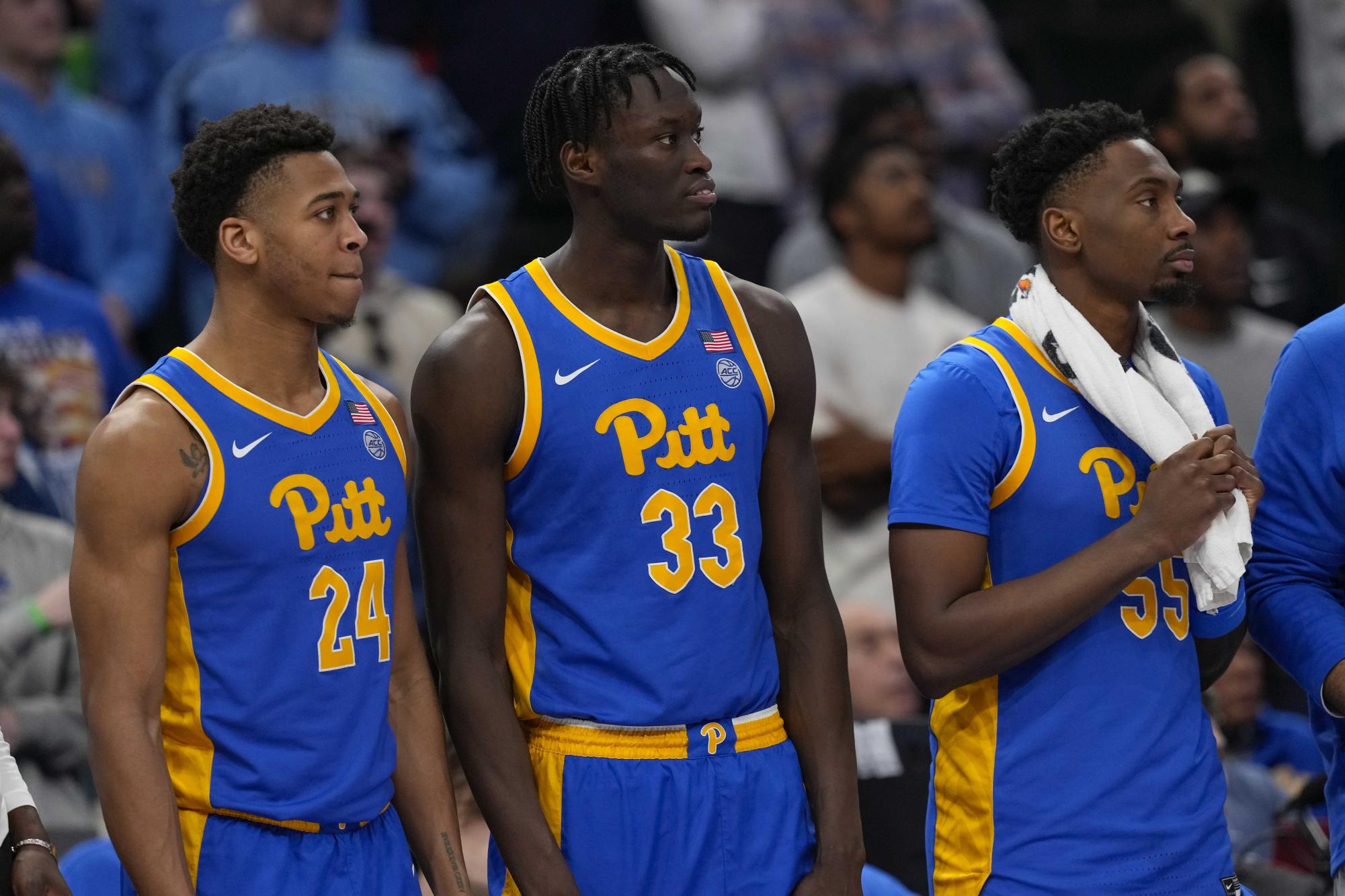
What are your thoughts on the new jerseys for this season? They're definitely similar to last year's but slightly more generic in terms of the template design on the shorts. I'm not a fan of the California font and the full lettering on the shorts, as both leave a lot left to be desired. The Under Armour designs in the latter years of the sponsorship were much more unique and original.
lights, camera, action 📸#GoBears pic.twitter.com/QbnOkyZKXO
— Cal Basketball (@CalMBBall) September 21, 2024


